
introduction
LocalToMe was created by 2nd year D3 and FWSD students as part of our final big project. My responsibilities in the team includes, leading UX/UI team, collecting user feedback, creating animations, and preparing prototypes for mobile and web platforms.
Tools
Figma, Trello, Illustrator, After Effects
Scope
A team of 3 designers and 3 developers. 14 weeks.
The problem
Nearly three in four Canadians reported that rising prices were affecting their ability to meet day-to-day expenses.
From Economic and Social Reports, Statistic Canada
Amidst the COVID-19 crisis, Canadians across the country are grappling with the burden of escalating food prices. How can we streamline assistance to ensure food security for low-income families, despite the challenges posed by inflation and the pandemic?
The solution
Empowering others through compassionate support and resource accessibility.
LocalToMe is a mobile application designed to provide a friendly and uplifting platform that reduces the stigma associated with seeking help from food banks, while facilitating access to food resources based on the needs and location of low-income families and individuals.
Discover nearby food-related organizations and events.
Easily find all available resources nearby, including detailed information such as contact details, opening hours, service requirements, and points of contact.
Explore nearby events and stay up-to-date on food bank resources in your area.
Participate in local events organized by members of your community.
Access public announcements and updates from nearby food organizations.
Participate and make an impact in your community
Create an event that you want to host for others to attend.
Keep your community informed with the latest news and updates.
The journey🌱
research
We began by conducting extensive research, delving into published papers and statistics, in order to gain a deeper understanding of the resources required by low-income families, including where, how, and why they are needed.

User Flow & Journey Map
Our site map was relatively simple and a solid foundation of the app. We did not want to overwhelmed our users with complicated flows. We stick to a simple flow that was straight forward and accessible with ease.

Our user journey map also helped us understand our users by illustrating the journey they go our app to complete a task.

competitive analysis
We conducted an analysis of our fellow competitors to identify the key features they excel in and areas where they could improve, in order to determine how we can enhance our own user experience.

user Survey findings
We received responses from 15 participants who completed our survey.
We reached out food banks organizations, Facebook groups, and the community for insights and perspectives from those who are low-incomed.
major commonalities


major pain points


user personas
After our findings, we found the people who might benefit best from our app are people who used Food Banks and people who volunteer or donate to food banks. The personas allowed us to empathize and understand our users better in order to relieve their pain points and concerns.


Low-fidelity designs
On Figma, we created our low-fidelity to showcased the flow and designs of the important features. Our primary focus was on how to deliver the necessary information to users with minimal navigation required.


style guide
Our style guide strive for accessibility and incorporates friendly, vibrant colors. We carefully evaluate our map pins, using a tool that replicates different types of color blindness to inform our choice of pin colors.


usability testing
Our goal was to determine the intuitiveness and accessibility of our app.
We gathered 4 participants and 1 participant with red-green color blindness to test out our app. Here we got postive and negative feedback about the features.
the positives

the negatives

refining designs
After three iterations of design, we arrived at our final iteration.

1. Tidy the structure and organization of favourited events and locations
We standardized the sizes of favorited items for consistency.
A search bar was added to expedite item retrieval, reducing the need for scrolling through lists.
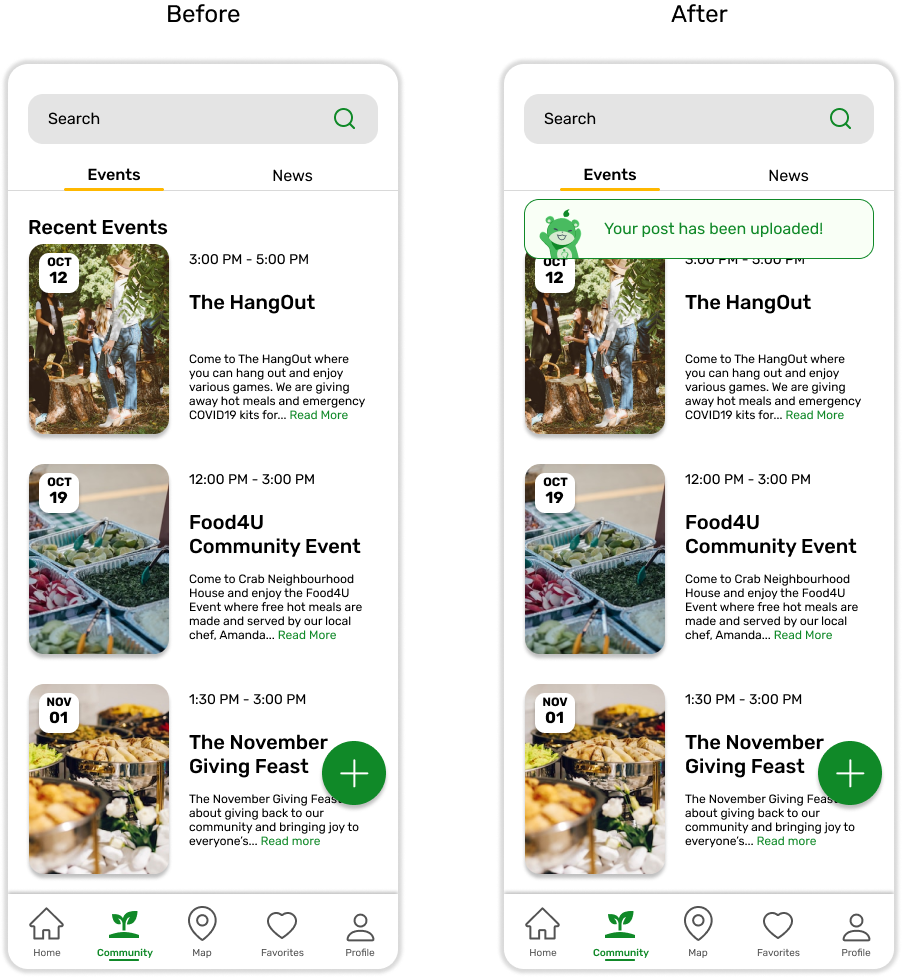
2. Add feedback to notify user that a task is completed
Our users was uncertainty about whether they had completed a task, as it was difficult to discern any changes. To address this, we introduced task completion and task failure pop-ups to ensure users receive immediate feedback on their actions.

3. Provide more options for users to navigate through
With only four options initially available, users felt constrained. This indicated the potential benefits of offering a wider range of choices. As a result, we expanded the variety of options available.
final product
Finally, the final designs was passed on to our developers.
Onboarding + Sign up/Login -> Home

Browsing Food Map

Viewing events and news in Community

Creating an event or news

Favorites + Profile and Setting

key takeaways
Just the beginning towards Food Security and Accessibility.
Food security is an ongoing world issue, and it welcomed all conversations and challenges that we don’t think about daily. It was a challenging concept to tackle, especially when it came to finding ways to ensure our app can provide usefulness and become a daily resource in someone’s life.
I was very proud of our team and the final product of LocalToMe. We were able to demonstrate our app to 100+ BCIT students, facilities, and alumni. Our team went to eat hotpot to celebrate the end of a big project.
01 – Trust and Communication is key:
In the start, it took us a while to feel comfortable with each other. We were all introverts in a group, so it was a team effort that we communicated and attended daily check-in. However, once we were all familiar with each other, our team’s productivity and energy got us in a healthy mindset which helped us stay positive all through the way.
02 – Never give up:
During our research process, we reached out to Food banks organizations for a survey. No replies. So, we continue looking for people. I personally reached out to Facebook groups and community forms in hopes of finding people who can shared their stories with us. Fortunately, we got answers and participants for our survey.
03 – Accessibility matters:
We believe our app should be accessible to all, however our app was mostly green, we knew this was a pose a major problem for those with red-green colorblindness.