
Introduction
Pronunci-Asian was created in order to raise awareness about a social issue in our community. The topic we decided to expand on was Asian Hate. For this project, I was a UX/UI designer, working with another UX/UI Designer and one Front-End Developer. I was responsible for creating illustrations and assets, producing low-fi and high-fi prototypes, and conducting user-testing.
Tools
Figma, Illustrator
Scope
A team of 3 designers/developers. 22 weeks.
The problem
Resources for learning and accurately pronouncing Asian names are limited or inaccessible.
Despite our celebration of diversity, the ongoing mispronunciation and misunderstanding of Asian names within our community persist, resulting in exclusion and underscoring the shortage of accessible resources. How can we promote inclusivity and guaranteeing the availability of resources for learning and accurately pronouncing Asian names?
The solution
Your Learning Hub for Name Pronunciation and Cultural Appreciation.
Pronunci-Asian is a social awareness app that seeks to eliminate the stigma surrounding Asian names by educating users on how to correctly pronounce names from various Asian countries while also providing information on their cultural significance.
Exploring Asian Names and Pronunciation Tricks.
Spark interest in understanding certain Asian names and provide tips for mastering their pronunciation hurdles.
Become a history guru!
Read about the intriguing stories and cultural traditions behind select Asian names.
The journey🌱
research
For our app inspiration, we researched other language learning apps like Duolingo as a starting point.
What inspired us from Duolingo:
1. Bright and vibrant colors
2. Rounded corners add a friendly feel to UI
3. Fun illustrations to show off personality
We researched apps that share information using tappable cards and took that as reference for how we may lay out our “History” lessons. We read articles about topics pertaining to Chinese, Japanese, Korean, and Vietnamese languages.

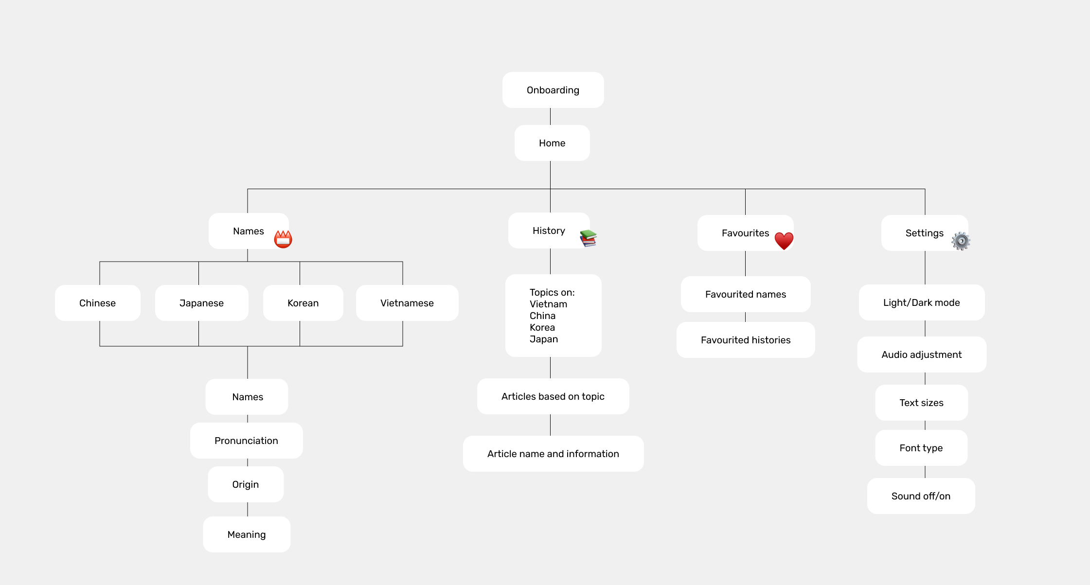
site map and content
We decided the main features of our app would be name pronunciations and educational reading materials. Based on those, we created a sitemap to planned the following contents of the app and determined a suitable user-flow.
user personas
For our social awareness app, we created two personas that targeted Gen-Z and Millennials, who may be the following:
01 - Students, instructors, and people who are surrounded by diversity.
02 - People who may feel embarrassed by their Asian names.
03 - People who want to improve their mother tongue pronunciation.
04 - People who are interested in learning about Asian languages.


Low-fidelity designs
Based on our site map, we swiftly created a low-fidelity prototype that followed a structured flow, encompassing splash screens, home page, names, history, favorites, and settings.


style guide
We took inspirations from many things in our culture, one of the main inspo was an iconic asian milk candy known as White Rabbit. Our color scheme pays homage to the candy, featuring white, black, blue, and red. These colors evoke nostalgia for those familiar with the candy, while offering a fresh, vibrant palette for others

usability testing
Our objective was to gain user feedback regarding the usability and accessibility of our pronunciation learning app.
We wanted to test our app in order to be certain that our app can communicate directly to our target audience as clear as possible. For our usability testing, we asked 7 participants to test out high-fidelity prototype.
major issues

recommendations to our findings
Refining high-fidelity to address its major issues.

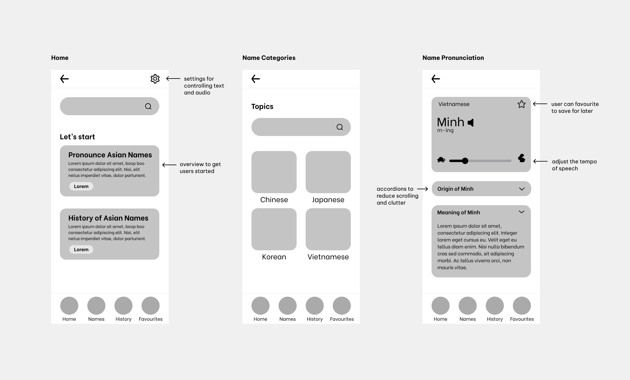
1. Enhance and resize the icons for clearer functional labeling.
Users had a difficult time noticing the “turtle” and the “rabbit” icon due its size. The functionality of the speed slider was not clear to some users.
The labels ensure users understand the functionality just from the icons.
“Maybe the turtle and the rabbit? I didn’t even know it’s there. And some fonts are little bit small”

2. Highlight the prominence of the Coco button.
Users did not think that Coco was a button. This caused users to initially click around or click the prompt instead. To make Coco look more like a button, we added a background and drop shadow to make it stand out.
“Didn’t realize that the “Coco” icon on the name page was clickable, want it to be more obvious.”

3. Improve setting nagivation for easier accessibility.
To enhance navigation to the settings, the "settings" page has been relocated to the navigation bar.
This allows users to access settings directly without needing to navigate through the "home" page.
final product
Our designs were finally ready for us to develop and adjust before publishing.
Onboarding + Home

Explore different unique names and pronunciations

Learning specific asian histories

Favorites + Setting

key takeaways
Challenges, Lessons Learned, and Future Improvements.
The idea of the app came when I first arrived to Canada, it was an intimidating experience, and my name seemed to add to the challenge. Many people struggled to pronounce my name, which left me wishing for "normal" English name. I grew out of that and embraced my name, realizing that there was no other name that could replace it.
This project was tough. It was the first time we put everything we learned from the UX Design Process to work and had to develop the app ourselves. In the end, we presented our project to 60+ students and faculty members. Overall, it was extremely challenging, but rewarding when it was all over.
What I would do differently:
01 – Never underestimate time:
One of the takeaways for me was managing time effectively. Along with being buried in homework from other courses, I definitely found myself racing against time trying to finish implementing features. Due to time restraints, some extra features had to be abandoned.
02 – Don’t be afraid to ask for help:
As someone that came from a creative and art background, coding was a nightmare. Because it was a huge learning curve, I spent a lot of time reading about JavaScript and React to try and fix problems myself. However, it was a waste of time when I realized my problems could’ve been solved in a day by asking for help from instructors and team members.