introduction
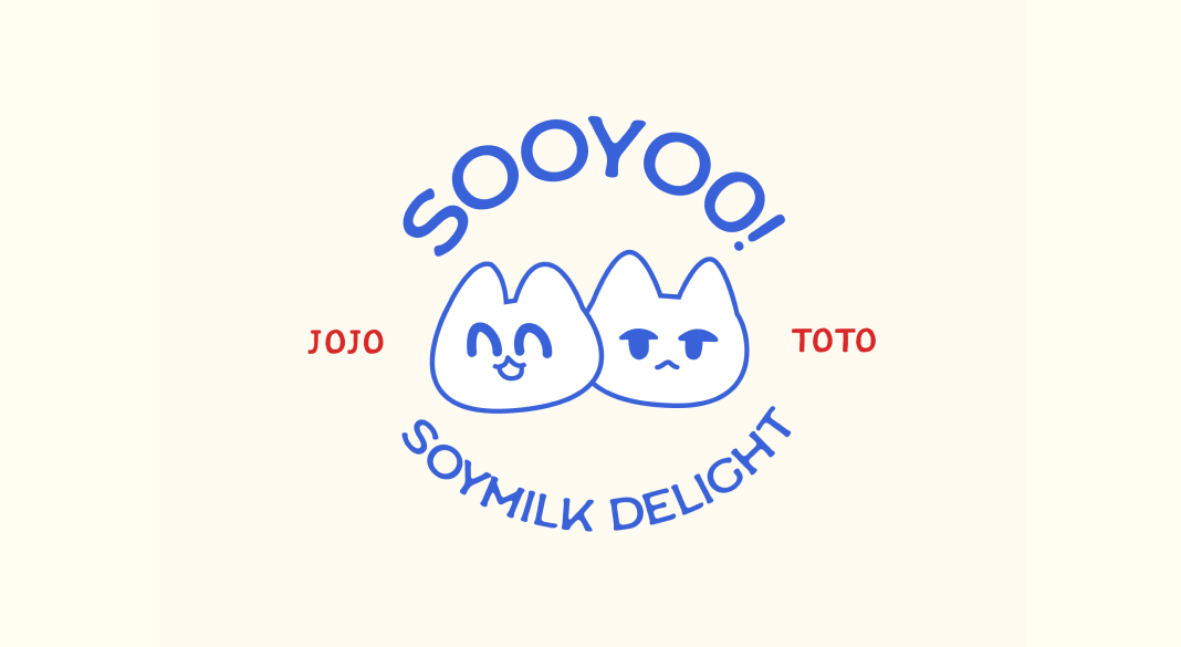
Sooyoo! is the crafted soy milk beverage that not only nourishes the body but also uplifts you with every sip. With a mission to spread joy and happiness, Sooyoo! embodies the playful essence of our beloved mascots, Toto and Jojo.
Tools
Photoshop, Illustrator
Scope
Myself. 2 weeks.
The journey🌱
ideation process
Bringing it to life.
For the designs, I was inspired by my childhood of consuming Asian drinks from my local Asian supermarket. One prominent element that made Asian can beverages different was their quirkiness. I went for a design that was appealing, fun, and full of personality.

logo designs
I drafted possible logos for the drinks that featured the mascots paired with retro typography to give it that clean and organic feel.

Final design
For the logo, I went with this one because it looks the cleanest from the rest and doesn't distract the whole design of the can. I aimed for the logo to feel rustic and retro, which is reflected in the vibrant colors and typography chosen.


product mockup
Using a die line template, each 175ml can was individually designed to correspond with its respective flavor, capturing the unique personality of each variant.

final product
I designed mockup posters suitable for advertising purposes, as well as for merchandise items like tote bags, perfect for carrying your essentials along with a can of Sooyoo.


